#GOLDBACKS #AURUM #GOLD #GOLDBANKNOTES #BANKNOTEDESIGN #DESIGN #USDOLLARS #USD #QFS
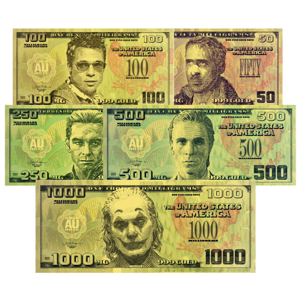
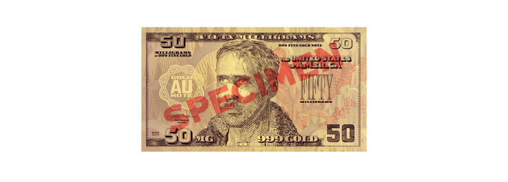
These are sketches for a proposal for upcoming artworks to be printed on a substrate made from fine gold. The plastic substrate has been anodized with a specific weight of gold, represented by each bill’s face value — 50, 100, 250, 500 and 1000 milligrams. The gold is fully recoverable, making these notes a completely new way to accumulate a gold investment.
Technical information will be coming soon. In this article, I discuss the artistic decisions and the story behind this series of designs.
How did you make these gold banknotes look valuable?
The key was to make a design that was as authentic as possible, with large, confident portraits, and well-chosen typefaces. There are two main problems with designing on a gold substrate: first, it limits the range of colors, as every color is multiplied by the gold underneath it. Second, ‘gold’ is metallic, so it doesn’t have a stable color — it’s a highly reflective texture that changes according to angle and light source. So the design had to be clear enough to be read effectively on a reflective background, and detailed enough to represent an authentic banknote design.
What considerations did you have when making these designs?
I always like the challenge of avoiding cliches, and there’s no better way to challenge yourself as an artist in this than redesigning US Dollars. Even riskier — using a gold substrate. Could there be more cliched, aged, and over-used imagery than the US Dollar, and gold? So the art challenge here was to create something distinctive, interesting, and contemporary, but honor the fact that these should be US-focused, real gold bills.
So how did I approach this? I looked to the most recent ‘golden age’ in American history — the Art Deco of the 1930s. This is a period that is increasingly seen as a high tidemark in American culture. It is full of myth and is part of modern-day American nostalgia for a more abundant, stable, productive, and youthful time.
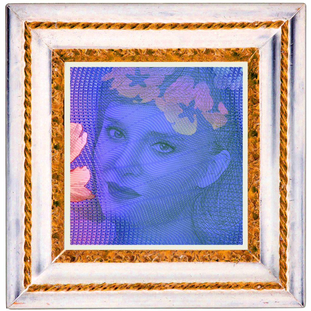
Art Deco provided some of the inspiration for the choice of typefaces. The light background is inspired by elements of the Chrysler building, an icon of American Art Deco and peak American know-how. It’s all subtle, and that’s what I love about design; a slight change — something reminiscent of a certain time in history — can shift the mood of a design. All this is stabilized in the familiar bordered US Dollar format.
I offset this nostalgia with faces that I feel represent the modern-day story of America — a long way from the triumph of Art Deco, Rhapsody in Blue, the New York skyline, hope.
Why these faces?
Let’s start with why people buy gold. I took inspiration from the gold-buying story. The bullion salesmen tell the usual story of hyperinflation, recalling images of German and Latin American paper money in wheelbarrows. As a gold buyer, and a heavy researcher of financial history, I’ve found the hyperinflation narrative quite a neat sales pitch, that doesn’t tell the full story: in the end, the real reason people scramble to own gold is that they no longer trust the public sector — government, ‘the system’. This is the scarier, realer reason to own gold, because it is contentious, dangerous, and once trust is lost, it’s hard and long to gain back.
I feel we’re at that moment today, across the Western world at least. And that is the modern-day image of America — decayed, broken, trust lost. That’s what these faces represent. They’re characters from films that tell the story of the end of trust in the American way. Even more than that, because they’re not ‘real people’ (of course, they’re real actors in character), they also represent the self-fulfilling prophesy of Hollywood film; America’s dystopia was dramatized on film first; the worship of these characters made them self-fulfilling.
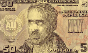
K — At the core of many science fiction self-fulfilling prophesy, is the idea that corporations control Human development. Blade Runner is a perfect example. In the 2049 remake, K (Ryan Gosling) represents the emotional effects of technological corporate dystopia. In the much-memed scene I worked from to make this portrait, K is standing in front of a large hologram of a girl who says “you look lonely, I can fix that.” The scene is open to interpretation, but I consider it to be a perfect depiction of the open sexuality of American society and the loneliness and emptiness it creates.
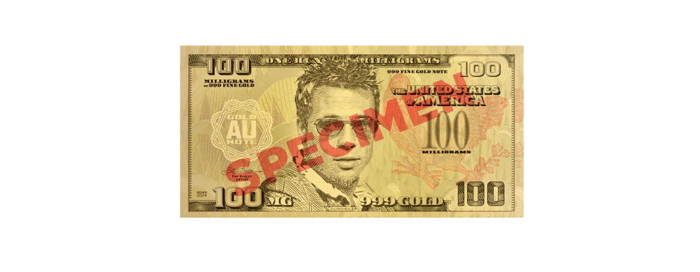
Tyler Durden — I worked from an image at a specific point in the film Fight Club, where Jack meets Tyler for the first time, on a plane. In this moment, Tyler Durden (Brad Pitt) represents transcendence through chaos, hiding behind inimitable American salesmanship — selling soap, rendered from the disposed fat from liposuction clinics — “selling women their fat asses back to them”, as the film says. Fight Club’s influence permeated culture, preempting the age of the ‘War on Terror’, and the degradation of a financial system built on credit, all driven by a generation of men who are the ‘middle children of history’.
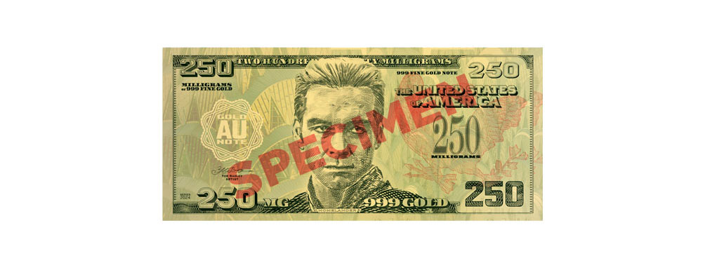
The Homelander — the character played by Antony Starr in the popular series The Boys. The character is a perfect story of modern America; created in a laboratory from a transhumanist genetic experiment, presented as an altruistic superhero, who in reality is reckless, paranoid and unable to accept his own flaws. The character of Homelander represents the relationship between the public and its atrophied government; the myth of the superhero / external savior is created in every election cycle, in proportion to the public’s feeling of helplessness and the unspoken belief that a greater power always knows better.
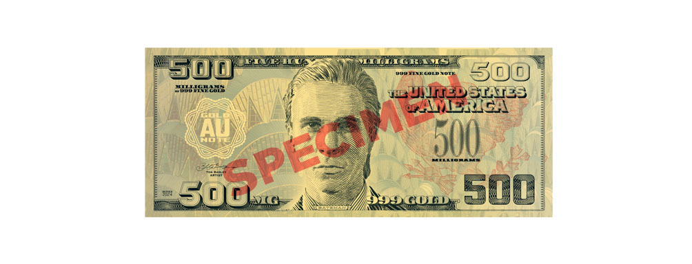
Patrick Bateman — the character played by Christian Bale in American Psycho continues to be used in out-of-context clips and memes to express hypocrisy, apathy, the silent wrath of corporate life, psychopathy, and the Sigma Male — the popular, successful, yet willfully isolated American man. I worked from a frame from the final scene of the film, in which Patrick Bateman looks directly at the camera and confesses to the audience that “my pain is constant and sharp, and I do not hope for a better world for anyone. In fact, I want my pain to be inflicted on others.” This face represents the ultimate destination of a culture that places all emphasis on appearances, to the point that the population is alienated from itself. Psychopathy results, and the pain of isolation turns to anger that can only be expressed through violence. And still this is ignored, through society’s addiction to maintaining appearances.
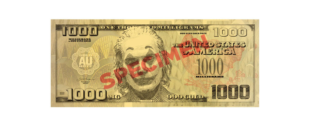
Joker — The main character of Joker (2019) summarizes and combines all the other characters, and so appears on the largest denomination. It underlines the themes of descent into mental illness, societal decay, the long-lost American dream, and the role of media and economic conditions in forming social chaos. Atypical of banknote portraits, I chose to show Joker looking down, his eyes hidden. This is an important choice; it gives the series an important understatement that contributes to their gravitas. There are many depictions of ‘the joker’ — many of them manically smiling. Smiles would have cheapened the design. This is a serious series, made from real gold, telling a sincere story.
Is the message negative?
It would seem that I’ve chosen to acknowledge negative aspects of the present to create these designs. These faces represent self-fulfilling prophesies, and we live their dystopia. Yet, they’re admired. This is often the paradox of art — there can be beauty in tragedy.
If anything, I want my work to be sincere, and pleasing to look at. In general, if something is executed well, by hand, isn’t vulgar, or purposely ugly, then it has enough humanity. Art that appeals to beauty has, at a base level, positive faith in human potential, no matter how seemingly negative the message. Human potential is communicated in something that is well-made by default.
Behind the apparent negative choice of characters, is the redemption in the beauty of art, and our deep, natural admiration for gold. There is something transcendental.
More white men on American-style currency! Boring
Here’s the difference between a private artist and a public organization: unlike a public-facing organization (like a central bank, a government, or a company), an artist doesn’t have to satisfy social conventions. This is the freedom of being an artist.
The friction in my work is that I use central bank-level or governmental-level design techniques to create something that looks like authentic currency. So while we’re in the realm of art, its easy to confuse my work with something that needs appeal to the same social responsibilities as a large organization.
I feel this is an important distinction to make, because ‘money art’, ‘banknote art’ or ‘currency art’ is a genre. I’m constantly careful to separate myself from this genre, because it makes money the medium: cutting up money to make collages, drawing on banknotes, etc. There is always something ironic in this because money is an unexpected medium.
In contrast, I use some of the authentic techniques of banknote design and printing, and this gives my work a sincerity that the rest of the ‘banknote art’ genre doesn’t necessarily have. I’m aiming somewhere completely different.
Being an artist, I’m free to pursue my own agenda. The need to fill a banknote series with a willfully diverse group of people is a completely different artistic challenge. I’m open to it, but my choice of characters is much more pointed. These specific characters represent the condition of masculinity at the twilight of the American dream, coincident with waning trust in government. Speaking in terms of economics, what we’re really talking about is the shift in capital from government bonds to private assets, like gold — and these characters represent the emotional dimension of that financial shift. This is the reality that inspired me to make these artworks.
The gold notes are currently available for pre-order at tombadley.net, and will be officially released early in 2024.