In part I, entitled Independent Currencies for Dummies, I offered a brief overview of the Local Currency sphere. And being a follower of all kinds of economic and social forecasting, I added my view on the FUTURE of Local currencies__a future that I consider to be very positive. Now in Part II, Im going to discuss the visual design of local currencies
Why dont local currencies look like national currencies? The question is deceptively simple
The easiest and least sexy answer: its a matter of print technology. Most local currencies are printed with a 4-colour process. Cyan, magenta, yellow and black ink is applied in tiny dots to make an image. This is the standard in commercial printing; its cost effective and feasible for large print runs.
Heres a close-up of CMYK printing
Most national currencies are printed with an offset process: bespoke colours are applied to rollers in a process called iris printing. This allows for the whole spectrum of ink colours, and a smooth transition between each colour__not dots.
Heres an example of iris printing
The other major print technique used on banknotes is intaglio__this is the raised lettering and engraving which is applied under pressure. It will feel rough to touch, and acts as a basic security feature because its hard to imitate without the original intaglio plates.
An example of intaglio:
Offset and Intaglio printing account for all the visual nuances that make a banknote look like a banknote. For example, no printer wants dust particles to show in the offset ink, so the designer incorporates tramlines__lots of minute lines that appear to be a block colour, that minimise defects caused by dust. If you look at a banknote closely, there arent many areas of solid colour. There isnt much point in doing the same with a 4-colour process, as the CMYK dots will just make the minute lines look fuzzy.
I wont go through every technical difference, but hopefully you get the idea: the visual nuances of a banknote are neither pompous nor frivolous; theyre a direct result of the printing processes involved.
There are other features of visual banknote design that are legacies from old technologies. For example: guilloche patterns. These are pretty patterns of varying complexity, often associated with banknotes.
They were originally engraved by a machine, called a Rose Engine. Back in the day (19thcentury), only security printers and watchmakers would have access to a Rose Engine, so they functioned as a security feature. Today, anyone can make similar patterns with Adobe Illustrator. Consequently, guilloches have lost their security, yet theyre visually associated with banknotes. A guilloche seems to say Hey! This is money! Its interesting then, that guilloches are sometimes to be found on local currencies. A guilloche lends currency, if you will, to what could be a simple voucher.
The Lewes Pound features a simple guilloche:
But is there more to it? Is the difference between national and local currency simply a technical difference?
Heres probably the most famous local currency note circulating in the UK__the Brixton Pound Bowie, designed by Charlie Waterhouse.
I had the opportunity to see Charlie give a nice presentation at the Guild of Independent Currencies 2016, earlier this year. He talked about his methodology for the design as a conscious rejection of the look and feel of national currency. The Brixton Pound has the basic ingredients__a number, lettering, logo, a portrait__and no more.
Charlie said: If it looked like national currency, it would communicate an anti-community, anti-local sentiment
Brixton £s play money feel is what hides its rebelliousness in plain sight.
By completely rejecting the look of national currency (by way of only including the bare bones of a banknote design), the Brixton Pound is punk money design__its brilliant!
But do all alternative currencies have the same aspiration?
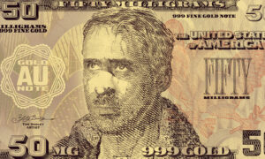
Ive worked with groups who have a different view. These are organizations that wish to launch alternative currencies, yet they want to their notes to resemble national currency as much as possible__regardless of the final printing process.
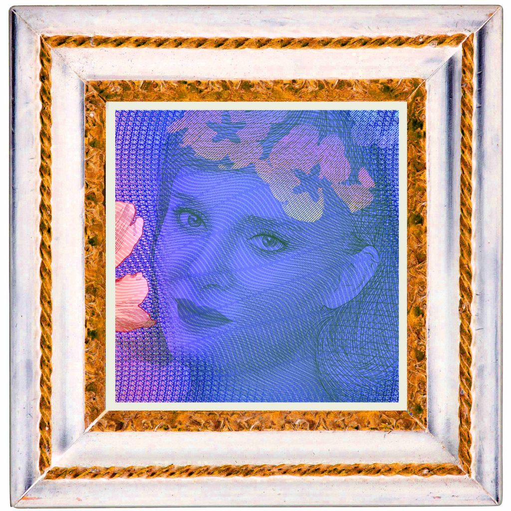
Heres two closeups of my work, for a proposed UK parallel currency:
How do we reconcile the pop activism of the Brixton Pound on the one hand, and the aspiration to compete with national currency on the other? Clearly, there are different politics in play here
As well as Charlie Waterhouses presentation, I watched a talk by Tom Crompton, from the Common Cause Foundation. The centrepiece from Toms lecture was the following chart:
This is a diagram of Basic Human Values__including things like Wisdom, Loyalty, Moderation, Authority, Pleasure, Daring, Independence etc. Each value is grouped under one of 10 headings__Universalism, Benevolence, Conformity, Tradition, Security, Power, Achievement, Hedonism, Stimulation, and Self-Direction.
These headings are arranged according to Extrinsic values to Intrinsic values, from left to right, and values of Self-Transcendence to values of the Physical Self from the top down. The result is a clock-face/map of human values. This map was the result of the Common Cause Foundations research into how charities marketed themselves, and the success of various marketing styles.
This blew me away! Tom Cromptons research has universal application__not just to marketing, but to ALL design and communication!
and maybe
banknote design.
Not only is this a great tool for all spheres of visual communication, it also explains why there might be more than one philosophy in the alternative currency space
and it might diagram why local currencies do not resemble national currencies.
National currencies TEND to appeal to Extrinsic values: Achievement, ambition, success, capability, pleasure, enjoying life, wealth, authority, social recognition. The currency of the UK is a suitable example:
And many local currencies TEND to aspire to Intrinsic values: Universalism, benevolence, helpfulness, responsibility, nature, social justice, equality, peace. A successful example would be the Bristol Pound, which feature cartoons, and other visually accessible elements that recall the graphical motifs from a typical UK high street, market or community mural:
It also explains why alternative currencies that hope to compete with the authority of national currencies might do so by resembling currencies issued by central banks.
As a designer who has worked in both worlds (of national and local currencies), Im wondering how the look and feel of national currency could communicate Intrinsic values. Why should national currency communicate exclusively Extrinsic values?
In a world where central bank policy is being questioned by many, the events of today portend great monetary change is almost upon us. The desire for a more benevolent, responsible, just and peaceful world is overflowing in proportion to the level of chaos and confusion humanity is experiencing. It begs the question: in a future built upon Intrinsic values, what will the paper money look like??
I intend to answer this question with my work _