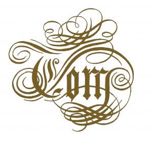
I wanted a personal insignia/logo that I could use on letterheads and marketing material. I thought it would be fun to combine formal flourished and gothic engraving with the informality of my first name.
Like a lot of my art, the inspiration was a banknote:
The original logo went through a freehand drawing process:
Once I was happy with the drawing, I vectorized it in Illustrator. For a few years, this satisfied my freelance design purposes. The logo found its way onto portfolios, CVs, websites, and invoices.
But it wasn’t enough. I wanted to elevate this insignia into expensive, unique, fine art. How?
First level unique and expensive: turn it into a banknote design.
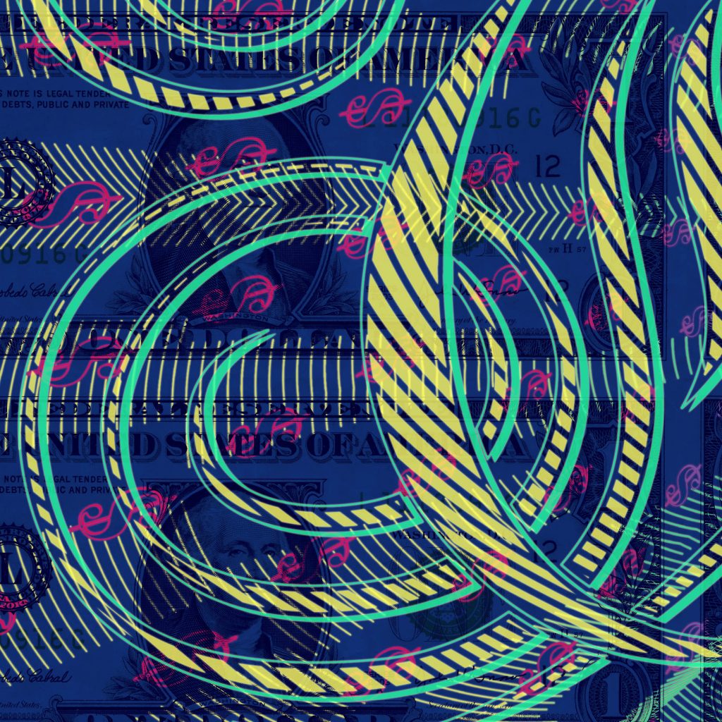
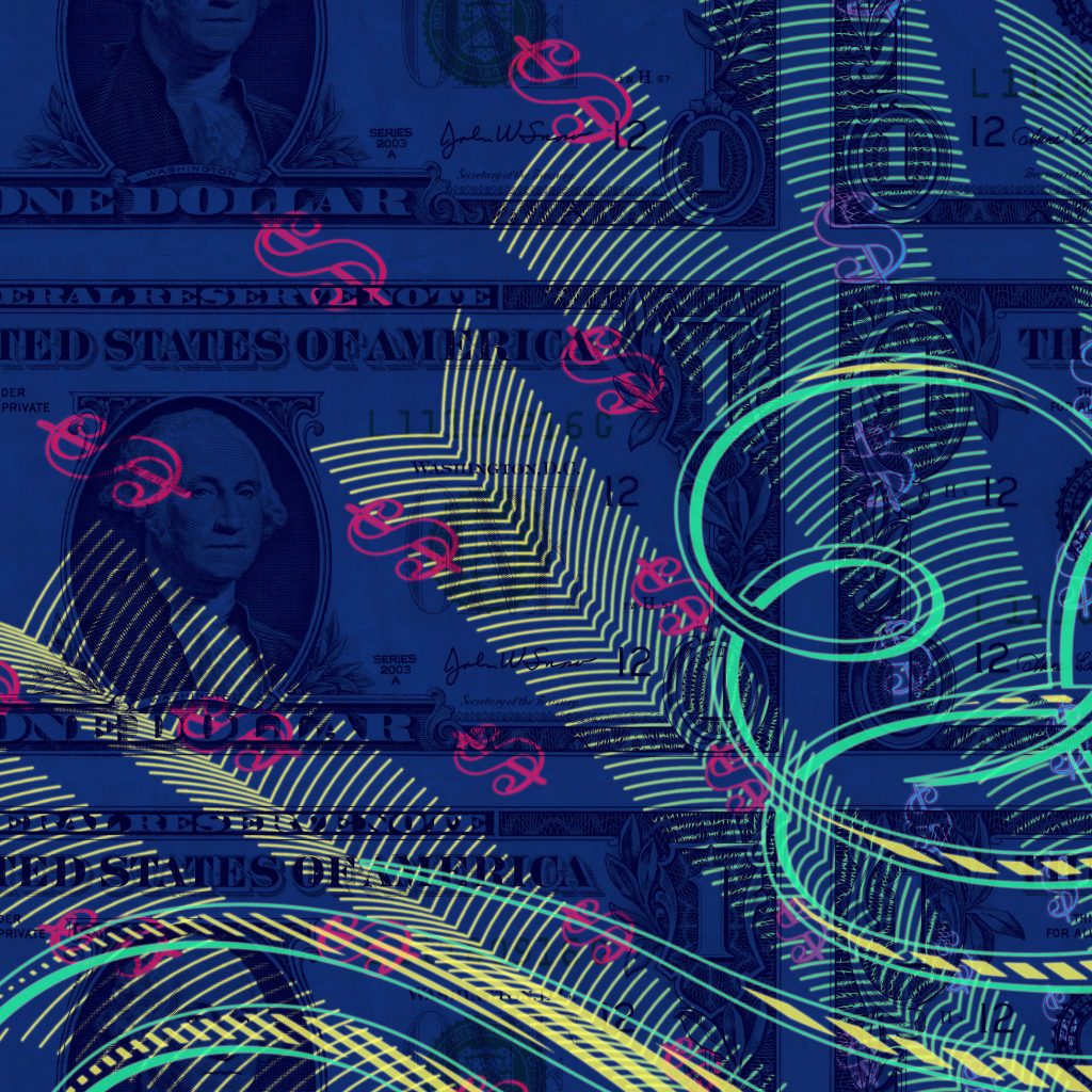
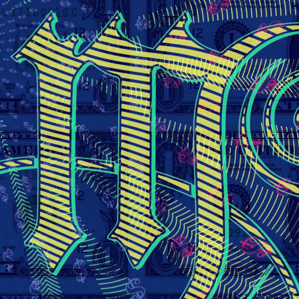
Second level unique and expensive: overprint it on an uncut sheet of existing currency.
Crazy level unique and expensive: overprint it on an uncut sheet of existing currency in four-colour Ultra Violet light-sensitive rainbow printed litho and flexographic inks – which is what I did.
The main insignia is rendered in fluorescent yellow and fluorescent green flexography – a rotary relief printing process where the inks are applied with rubber plates. The background lines and dollar signs are are composed of two litho layers in perfect registration, each with two rainbow blends.
The finished artwork can only be fully viewed under UV light.
The use of thicker flexography lines gives the original logo an illustrated feel, similar to the line work of early Andy Warhol, while the theme and sentiment is a blend of Baroque and Pop Art.