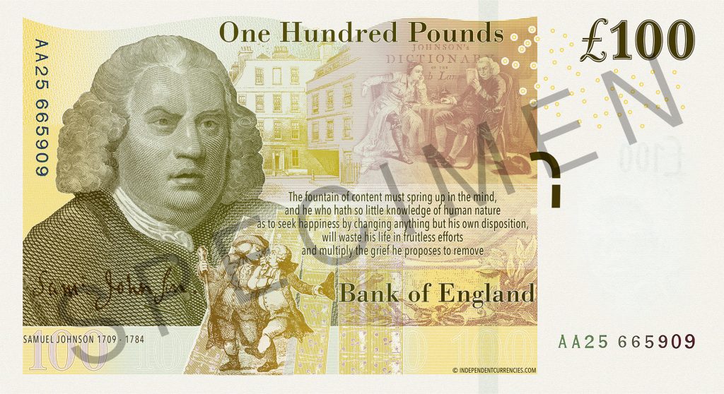
Two things inspired this design: inflation and Brexit. Greater inflation can provoke a central bank to issue higher value currency. And Brexit – the ‘Brexit situation’ is a cultural phenomenon in flux, so rather than react to it, my design instinct is to celebrate British legacy, rather than fuss about the transient present and unknown future. There is no better place to do this than a banknote design, where the portrait subject has to be dead to be featured. So by definition, a British banknote celebrates British legacy.
In the wake of the original Brexit referendum, I was reading Steven Covey’s The 7 Habits Of Highly Successful People. Covey references a quote by English poet, playwright, and essayist Samuel Johnson:
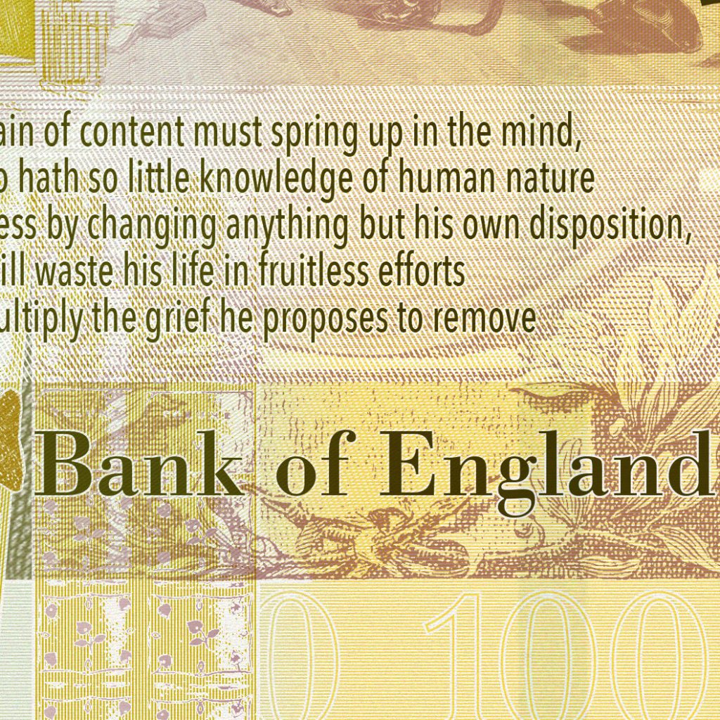
“THE FOUNTAIN OF CONTENT MUST SPRING UP IN THE MIND, AND HE WHO HATH SO LITTLE KNOWLEDGE OF HUMAN NATURE TO SEEK HAPPINESS BY CHANGING ANYTHING BUT HIS OWN DISPOSITION, WILL WASTE HIS LIFE IN FRUITLESS EFFORTS AND MULTIPLY THE GRIEF HE PROPOSES TO REMOVE.”
Both Brexit and this quote are melded in my mind, and the subject matter for the banknote design was set. Simultaneously, Johnson offers a self-development solution to a political problem, three centuries ahead of time.
However, all this was just the starting point. The challenge and fun of the design was in matching the fonts and replicating the sensibilities of the existing Bank Of England series in order to create a compelling addition, as well as deconstructing the existing designs on a technical level and recreating them in a functioning banknote.
Series Twenty Pound Note
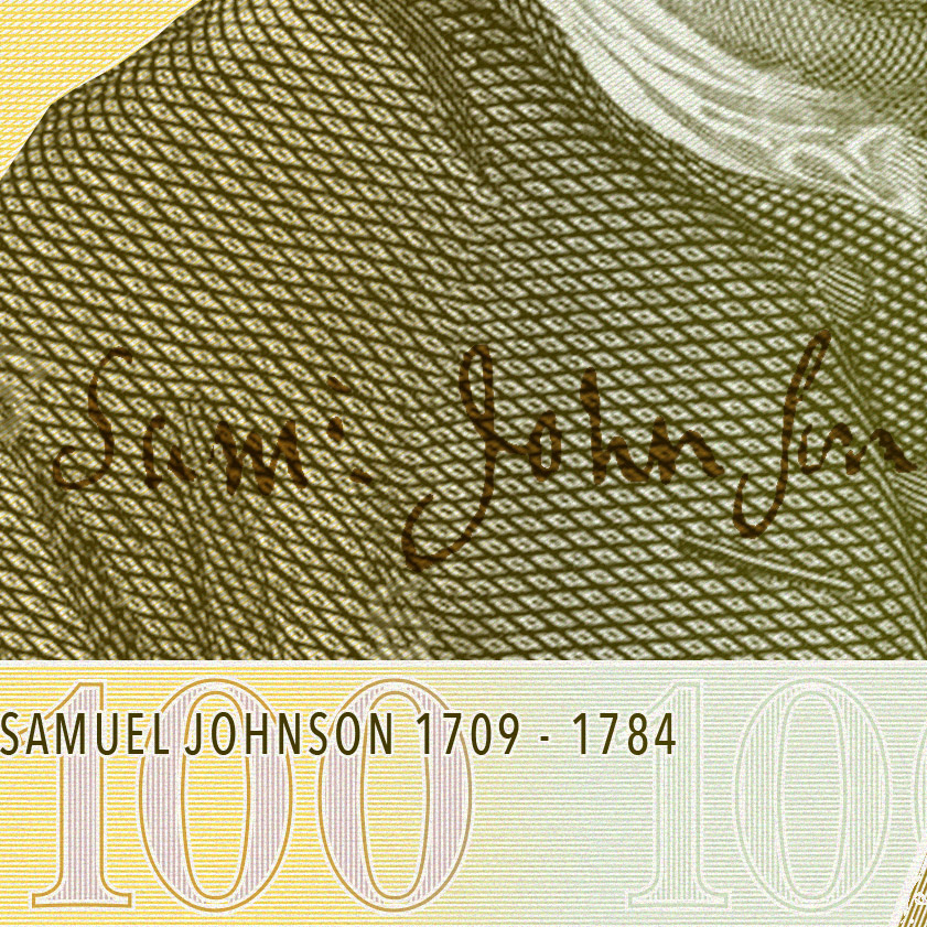
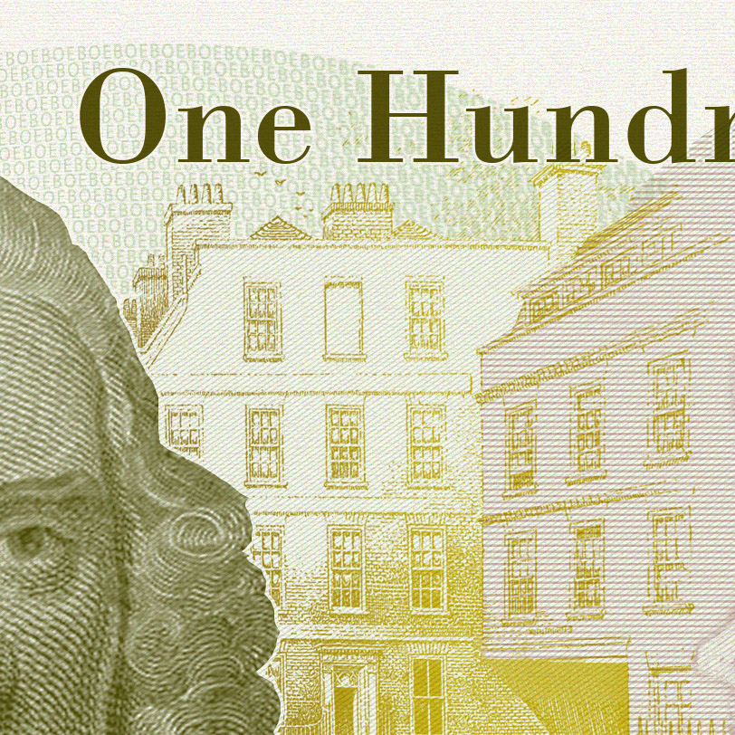
The banknote details mimic the original series. Typography nerds (I am one) will note the Bank of England’s use of Avenir Condensed and Bodoni. The Bank Of England has never been afraid of clashing and apparently disparate typeface. Unlike so many banknotes, BOE notes frequently combine serif, sans serif, Old English and more utilitarian typface. This lends BOE notes a subtle complexity.